What might you say if I told you I painted our hallway black. Seriously.
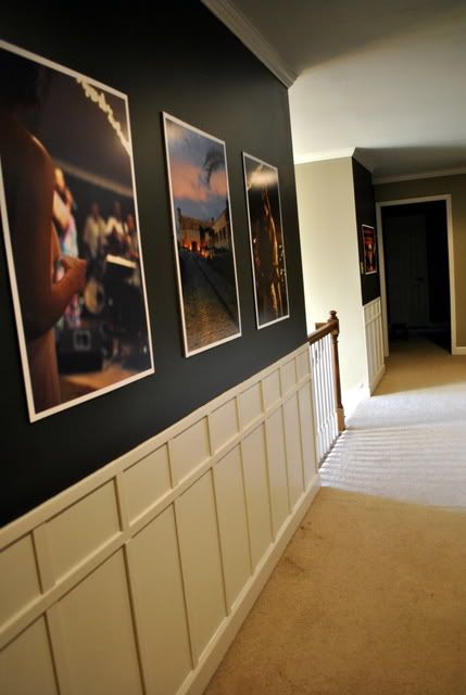
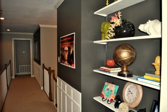
If you know me at all, you wouldn't be surprised. Let me just say, it's gorgeous! Especially since it is grounded with white wainscoting for beautiful contrast.
If you know me at all, you wouldn't be surprised. Let me just say, it's gorgeous! Especially since it is grounded with white wainscoting for beautiful contrast.
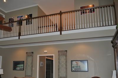
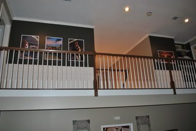
The upper hallway in our house overlooks the living room with a catwalk, which poses a great opportunity to make a statement.
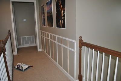
But before...The statement was, "I'm just boring."
It needed attention and so I focused my diy energy on this little hallway and nook for a couple weekends, working between weddings, showers, ballgames, and end of year paperwork.
It needed attention and so I focused my diy energy on this little hallway and nook for a couple weekends, working between weddings, showers, ballgames, and end of year paperwork.
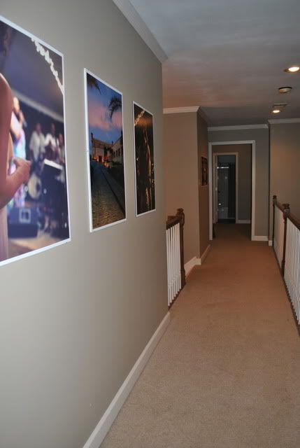
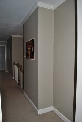
The "Beige Sand" color that our whole living room is painted made the upstairs hallway boringly bland.
No flavor.
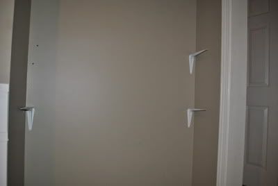
There was also a weird nook to the right with nothing in it. The wall just seemed to recede there for no reason at all.
But recessed lighting spotlighted the hallway walls like a perfect art gallery set-up that could be viewed from upstairs or down, so there was definitely potential.
Before:
In the picture above, you see enlarged photos taken from either our wedding reception or honeymoon. I had 20x30 posterboards made by Costco for $25 each. The artwork was beautiful, but it definitely wasn't given the highlight it deserved.
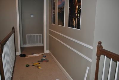
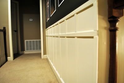
To start Operation: "Give this hallway some personality," I added wainscoting to the bottom third of the wall. Much like my faux board and batten treatment in the kitchen, I used pieces of pine lattice to create the effect, this time placing them horizontal and vertical to form a 2-panel look. I started with a long piece horizontally for the top, about 36 inches from the floor, since there was not an existing chair rail. Wood glue in a caulk gun and painters tape held it in place and finishing nails were then hammered in. Then I did the same about 6 inches below that.
Pieces were then cut to fit in the top and bottom space vertically about 10 inches apart to create the finished look.
I then painted all of it in "Classic Creme."
As for the top half of the wall...I pondered. Bright punch of color? Light and airy? Dark and Dramatic?
I opted for option C, since it's such an open and airy space to begin with and receives great light all around. And I looove dark accent walls.
In this case, I went just about as dark as I could get away with. As in pretty much black. I mixed about half and half "Wild Truffle" in satin, which we used to paint our cozy movie room, with "Black Onyx" in semi-gloss. It would be a rich and bold charcoal with just a hint of glossy sheen.
Nothing makes artwork pop like a black backdrop.
After:
Love love LOVE!!
Scroll back up to that before.
Now scroll back down.
It's like the space was naked before, and now it's dressed!
We have leftover hardwood from what we installed in the living room so we'll see if it's enough to finish up this upstairs hallway. The hardwood floors would really finish it up!
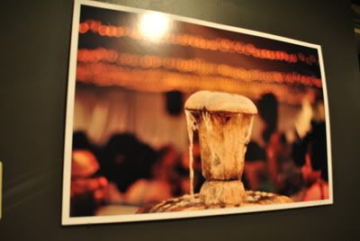
The above picture was one of my FAVORITES from our reception. The water from the fountain in motion and the twinkle lights...beautiful. That's Sean's basketball coach he played for then assisted looking across at his wife. It's a breathtaking image!
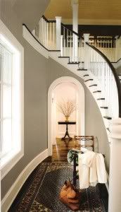
I was originally inspired by this image I pinned for Benjamin Moore paint colors. I loved the idea of the greige walls below with the upper hallway dark with white wainscoting.
I was originally inspired by this image I pinned for Benjamin Moore paint colors. I loved the idea of the greige walls below with the upper hallway dark with white wainscoting.
So, with the first half done, now to tend to that weird nook.
Before:
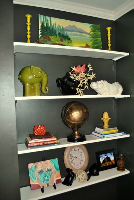
At one point, I thought of creating a reading nook with a padded bench seat wedged inside and bookshelves all around. But that would be like sitting in a window seat with no window, leaving me always wishing for one. So I decided that little space was meant to be a built in shelving unit all along and just hadn't found it's purpose in life yet.
I picked up shelf brackets from Home Depot and got Sean to install while I cut the 4 wood shelves from 8 foot pieces I also got from Home Depot.
With a coat of white for the shelves and the same dark paint for the nook, we finished this upstairs space with 2 weekends of work.
After:
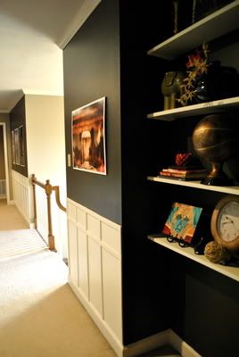
I accessorized with books, ceramics, a clock and artwork.
Recognize any of these guys on the shelf? They all got a makeover with spray paint.

View from the living room:
Sometime soon, probably this summer, I'll be able to polish up the living room and share the whole thing. I know it's been a long time coming but it really is a process!
Meanwhile, another little "nook" of the house is crossed off the list.
Daring but classic gallery wall and display unit...
Check!
Now go paint something dark!
~Katie
Follow @ktgray13



Black?! I was afraid to scroll down and look. And then to my surprise... I really like it! I should have never doubted you. You are so talented.
ReplyDeleteThanks for making my day! I love your comments. And I love surprising people :)
ReplyDelete